Soven Café & Pâtisserie
A warm identity for coffee, cake and everyday moments.
Soven is a café and cake brand. Our goal was to build a visual identity that feels premium, comfortable and welcoming.
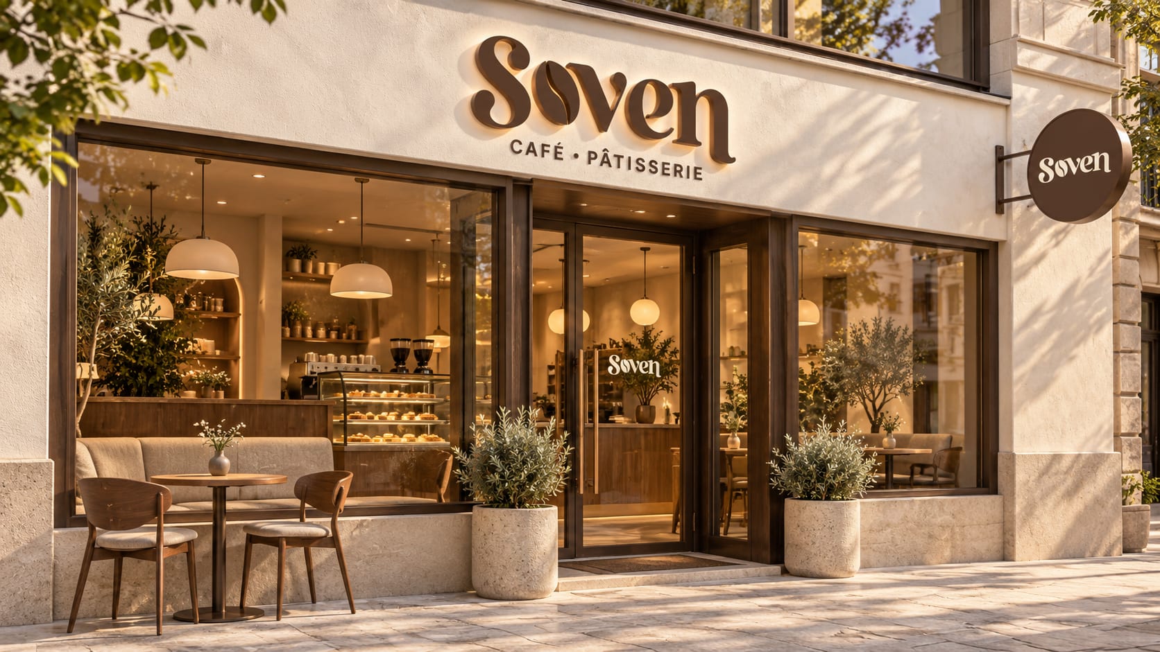
SOVEN - CAFE . PATTSSERIE
Meaning: A coined name with a warm, understated European character.
Brand story: A little everyday luxury, where thoughtfully brewed coffee meets beautifully crafted cakes.
Tagline: Everyday Moments, Made Special.
1. Brand strategy
Brand category: Coffee · Cakes · Patisserie · Café
Brand personality: Elegant, warm, artistic, modern, welcoming.
Target audience: Young professionals, couples, students, families, and people who enjoy premium café experiences.
Brand positioning: European-inspired café aesthetics with approachable everyday indulgence.
Project overview
Soven is a café and cake brand. Our goal was to build a visual identity that feels premium, comfortable and welcoming.
Starting with the supplied Soven logo, we developed a branding concept across packaging, stationery, uniforms, signage, social media and digital experiences. Every design follows the same simple idea: make the brand recognisable without adding unnecessary decoration.
The design challenge
Coffee and cake brands often use similar colours and symbols. Soven needed a clear visual identity that could stand out while still feeling familiar.
The design also needed to work at different sizes from a small sticker on a box to a large sign outside the café.
The logo idea
The Soven wordmark combines expressive serif letters with a coffee-bean shape in place of the letter “o”. This connects the name directly to coffee without adding a separate symbol.
The curved letters give the logo a soft, welcoming character. Their bold shapes help the name stay visible on cups, bags and signage.
The descriptor, “CAFÉ • PÂTISSERIE,” explains the offering and gives coffee and cakes equal importance.
For consistent use, the wordmark should always come from the original logo artwork. It should not be recreated by typing the name in a similar font.
Choosing the colours
We built the visual direction around colours connected to coffee, milk, chocolate and natural materials.
| Colour | Why it fits | Where it works |
|---|---|---|
| Espresso Brown | Adds warmth, depth and a clear connection to coffee. | Logos, packaging, signage and headings. |
| Warm Ivory | Creates a soft, clean background and gives the design space. | Menus, stationery, walls and digital layouts. |
| Latte Beige | Brings a gentle supporting tone to the palette. | Patterns, packaging details and interior accents. |
| Soft Charcoal | Provides contrast without the harshness of pure black. | Supporting text and small details. |
Ivory keeps the brand light and welcoming. Brown creates recognition, while beige adds variety without making the design feel busy.
Choosing the typography
We proposed two supporting typefaces to complement the logo.
Cormorant Garamond brings an elegant character to headings, menu titles and short brand messages. Its serif details suit the café’s premium direction.
Montserrat provides a clear, simple style for descriptions, contact details, navigation and other practical information.
Each typeface has a clear job. The heading font adds personality; the supporting font makes information easy to read.
Building the brand pattern
The coffee-bean shape from the logo becomes a repeating pattern. This gives Soven a recognisable graphic element beyond the wordmark.
We applied it to cup sleeves, bag sides, box edges, envelope linings and apron pockets. Using it in selected areas keeps the identity consistent while leaving enough plain space around the logo.
Bringing the identity into everyday use
The packaging concepts combine clear logo placement with practical colour variations. Coffee cups, cake boxes, bags, labels and seals feel like one family.
Stationery and menus use generous spacing and a clear reading order. The premium menu concept introduces a textured cover, subtle foil lettering and a debossed pattern.
Uniforms use smaller logos and controlled pattern details. Exterior signage makes the name prominent, while the interior concept carries the palette into walls, seating and materials.
Creating the digital direction
The website and app concepts extend the same colours and typography into clear layouts for browsing coffee, cakes and contact information.
For social media, we explored natural café photography with minimal text. Product close-ups, serving moments and coffee preparation give the brand a more human feel. Small logo placements allow the photography to remain the focus.
The result
The concept shows how one logo, a focused colour palette and a simple pattern can connect the whole brand experience.
From a takeaway cup to a storefront, Soven has a consistent visual direction: warm, recognisable and easy to understand.
This case study presents design concepts and mockups. Printed production, live digital products and customer results are outside the scope shown.